
Travel Performance Dashboard
Web App / TripActions / 2020
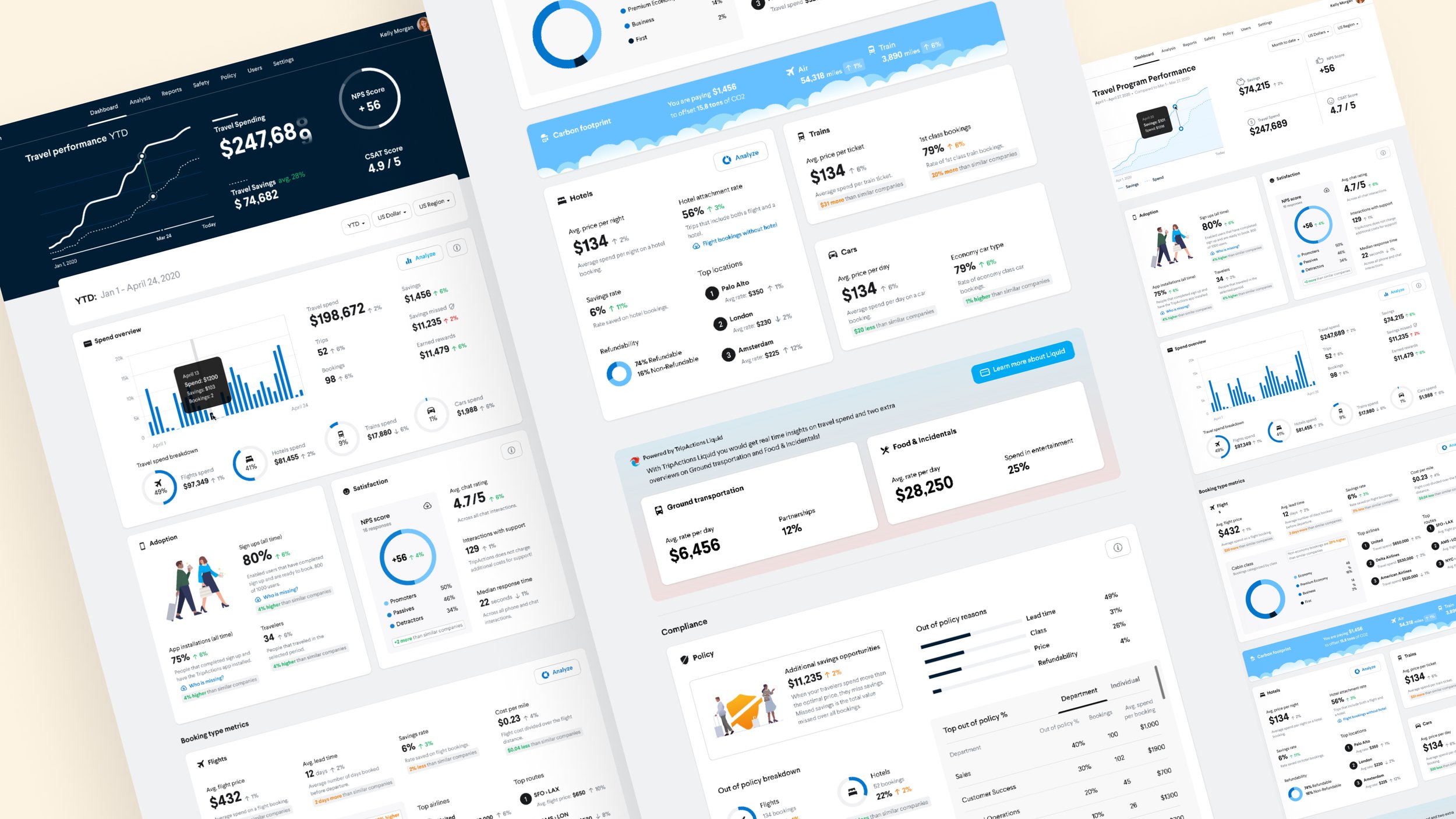
Data is so cool, especially if you know what it means and what to do with it! We had plenty of it at TripActions, but we were not taking advantage of its full potential. That's why we decide to build the coolest dashboard out there.

Problem
Our customers, mostly travel managers, needed to ensure their travel program was performing well and their spending goals were on track. TripActions' Customer Success Managers spent hours building presentations to help our customers reach their targets. We wanted to support them both, so the goal was not just to build a dashboard to show data; it was also about analyzing it and showing them how to use it.
Process
-

Collect and analyze
The first thing to do was to collect the data that the CSMs (Customer Success Managers) used to help our customers. I reached out to them, got their presentations and analyzed them, organized the data into subjects, and highlighted whatever seemed most relevant.
-

Interviews
Out of the presentations, I made collages to show the CSMs and customers to confirm whether the insights I determined and organized made sense. It took time to do enough interviews because our customers are very diverse, and their needs differ. The most important subjects were safety, spending, and performance.
-

Wireframes
Data can be very chaotic and unclear. Finding the proper layout was a real challenge since we had so many different elements to include, and I really wanted to design something pleasant to look at instead of overwhelming. Building multiple wireframes helped me develop a good layout before jumping into details.
Design
I had fun coming up with new ways to show data, and it was a collaborative design process. I worked closely with the engineers since we needed to build a responsive dashboard with elements that needed to be simple to code and pleasing to the eye. We didn't have data components in our design system, so I had to stay consistent and design new ones from scratch.


Alternative design solutions


Conclusion
Our customers loved the dashboard and kept asking to add more to it, so this project will continue evolving. It was one of the most exciting designs because I had never worked on a dashboard before, and I had to take a different approach during the research. I did not think data could be fun, but I definitely changed my mind.


The team:
Marta Ceffa · Product Designer
Alina Tudose + Muhammad Maaz + Rhythm Jain · Frontend Developers
Luan Refatti + Birkan Pala + Mustafa Hussain · Backend Developers
Zoran Kovacevic · Product Manager
Other projects


